Design Popup
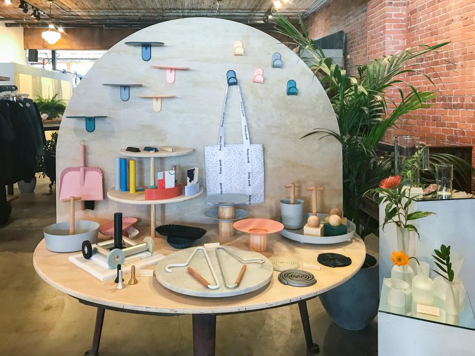
Glasswing does an exceptional job at popups and the April Design Shop featuring Good Thing is a great example of how to implement a visual collaboration.
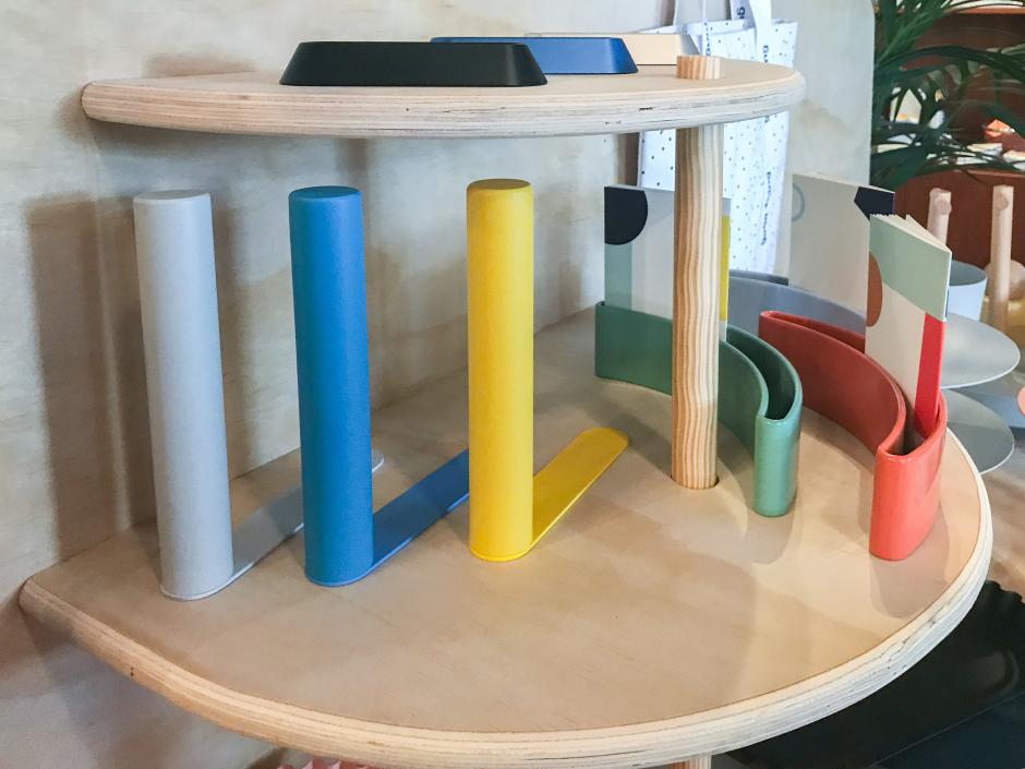
We love how the concept embraces "the modern take on household accessories that are thoughtful and can be enjoyed by everyone" in an uniform presentation that stands out amist the Kinfolk-esque visual merchandising of the lifestyle boutique. It's immediately clear to the consumer that something special is happening by using color and shape as visual marketing cues.
Within the social realm, the duo worked together to create content that embraced usability on Instagram. Not only did Glasswing "take over" Good Thing's feed but they also partnered with makers/friends in Seattle with distinctive tastes to highlight the theme of collaboration.
Best of all, the Glasswing and Good Thing brands coexist seamlessly in a study of physical (retail) and virtual (social) simplexity.

